Meta Reveals The New Facebook Logo
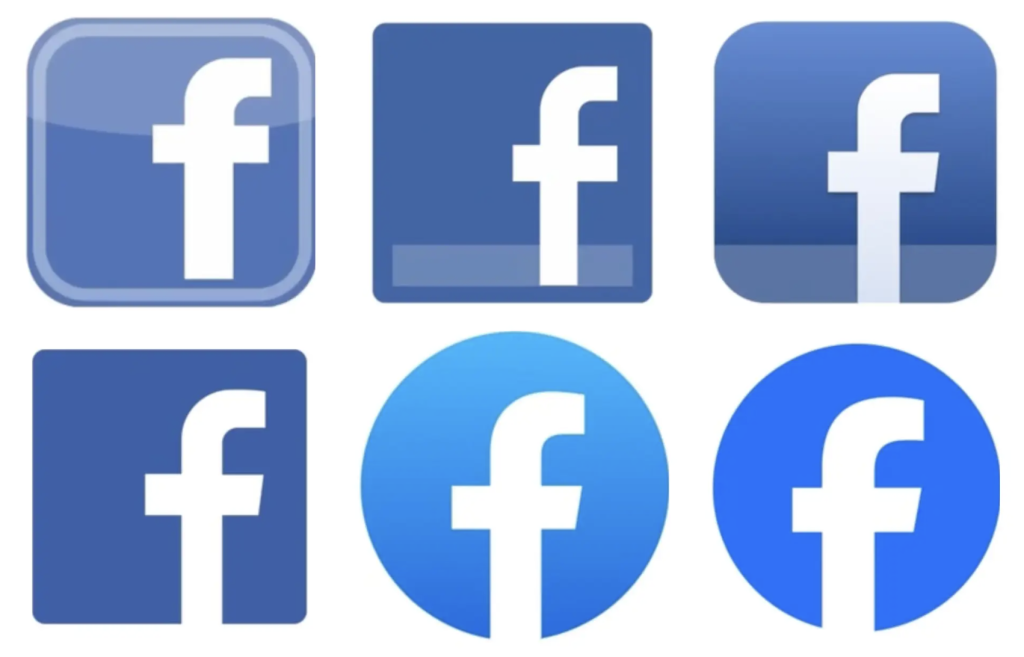
Have you noticed something different on Facebook? Well… It’s not that obvious. Last week Meta shared the updated Facebook logo. The social media application is known for its blue “F” branding, and the changes are minimal. The logo has been updated to a darker blue shade and the “F” can be seen as slightly larger.

Meta announced that the social network is beginning to “rebrand” its identity. The company wants to create a refreshed design that is “everlasting”. In an article by Meta, they mentioned the 3 key driving factors for the re-brand:
- “Elevate the most iconic elements of our brand to create a distinctive, refreshed Facebook”
- “Unify how the Facebook brand comes to life across product-to-marketing experiences”
- “Create an expansive set of colors — anchored in our core blue — that is comprehensive and vibrant, and also designed to be more accessible for people”
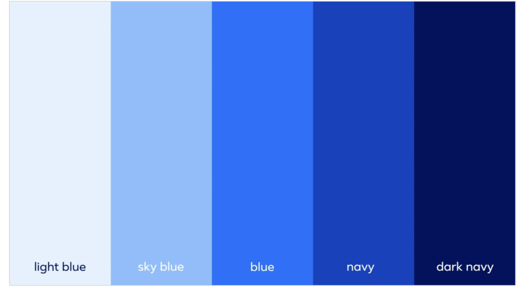
Facebook has also released its new brand color palette, as well as updated its “reactions” to fit within the new branding. The palette consists of five different shades of blue ranging from light to dark.


So, how are we feeling about the new color and brand updates?
To be honest, it feels like nothing has changed. The darker shade of blue may catch some die-hard FB user’s eyes. If you are logging on to the site this week, be on the lookout for the updated color scheme!
Want to keep up with the latest on Facebook? Then you are in the right place! We have all the updates here for you.

