

Why Instagram Design Matters for Your Profile and Business
 Isabel Romero
23 June 2026
Isabel Romero
23 June 2026 
Open any Instagram profile and the first decision your eye makes happens before you read a single word. You take in the grid, the colors, the spacing, and the kind of person or brand on the other side of the screen. That snap judgment is what Instagram design is about, and it’s why your choices around color, layout, fonts, and image quality shape whether someone follows you, scrolls past, or saves a post.
This guide covers how to design an Instagram profile that feels intentional. We’ll look at the building blocks of a cohesive look, the feed layout styles that suit different kinds of brands, how to build a carousel that earns swipes, how to set up the profile itself, and the tools that make all of this simpler to manage. There’s no single right look for every account, but some patterns work again and again, and some fall flat just as often.
The Building Blocks of a Cohesive Look
When someone visits your profile for the first time, they take in the overall feel before they read a caption. A few details carry most of that weight.
- Colors. Your palette sets the mood. Bright, bold colors read as fun and energetic. Soft, muted tones feel calmer and more professional. Pick a direction and stay with it so your feed holds together.
- Fonts. Keep them simple and easy to read. Too many styles turn into visual noise, while one or two complementary fonts keep things clean and on brand.
- Filters. A consistent filter ties your photos together. A warm tone or a cool one, applied the same way each time, gives the feed a recognizable look.
- Image quality. Blurry or pixelated photos look bad anywhere, and Instagram is no exception. Clear, sharp images change how people judge your brand in a second.
- Feed layout. How you arrange posts holds the whole look together. Alternating colors, balancing text posts with photos, or following a set pattern makes your feed easier to scan and move through.
Feed Layout Styles Worth Trying
How you organize your posts says something about your brand before anyone reads a word. A planned layout looks more polished, and it gives visitors a quick read on your personality, whether that’s playful and creative or clean and minimal. Here are the styles that tend to work, with real profiles using each one.
Checkerboard
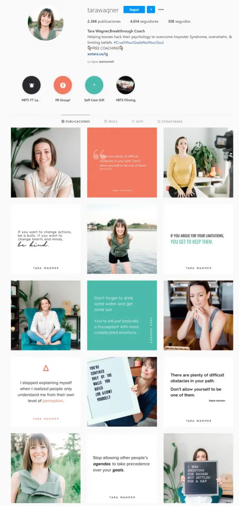
Picture a chessboard: one type of post, then a different type, then back again. A photo, then a quote, then a photo. The pattern adds balance and breaks up your content so the feed stays interesting without feeling crowded. Tara Wagner runs her profile this way, switching between text-heavy posts and photos of herself against different backgrounds, which keeps the grid fresh.
Horizontal Rows
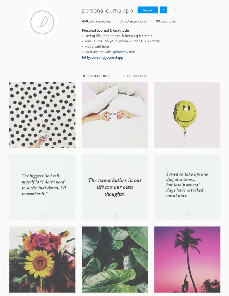
Here each row across your grid covers one theme or tells a small story, like splitting your feed into chapters. You might give one row to customer testimonials, the next to behind-the-scenes content, and a third to product demos. It’s a clean way to group related content so followers find what interests them. Personaljournalapp uses this approach, with one section for quotes and the next for artistic photos.
Vertical Columns
This is the same idea turned on its side. You sort posts into three columns, each covering a category, which suits a series of related items like product colors or content themes. Cocó Constans does this well, keeping separate columns for quotes, recipes, and exercises so followers spot what they want right away. It stays clean even when you post a lot.

Puzzle Style
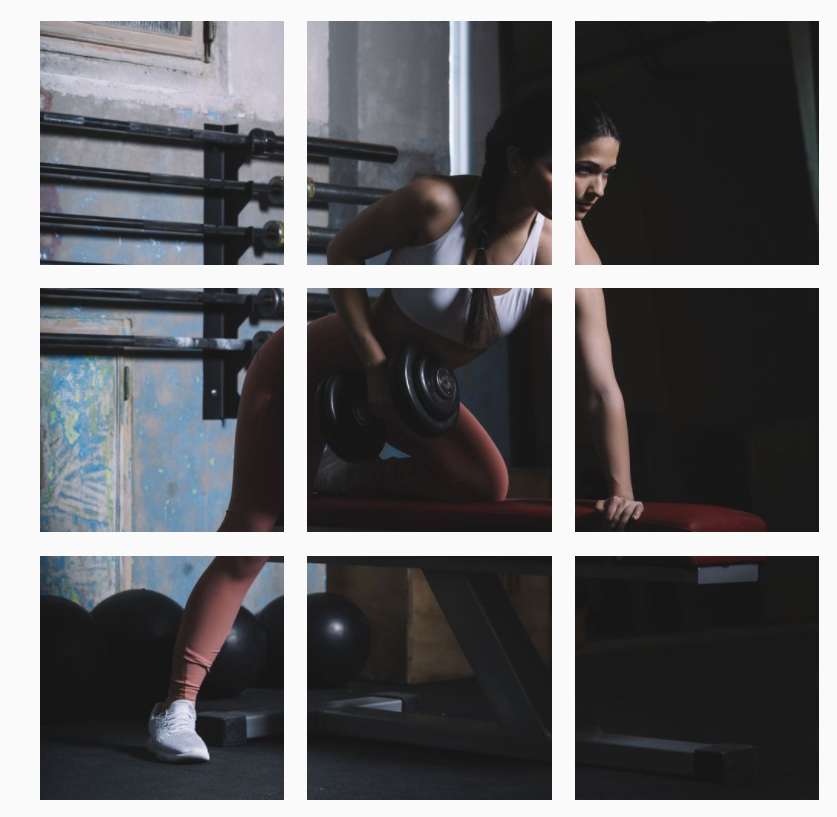
A puzzle feed breaks one large image into several posts that line up into a single picture across your grid. It makes a strong first impression and keeps followers curious about what comes next. It takes the most planning of any style here, since every post has to fit, and the payoff is a feed that looks like nothing else. PetitFit_Team uses their first nine posts to form one full image.
Colored Borders
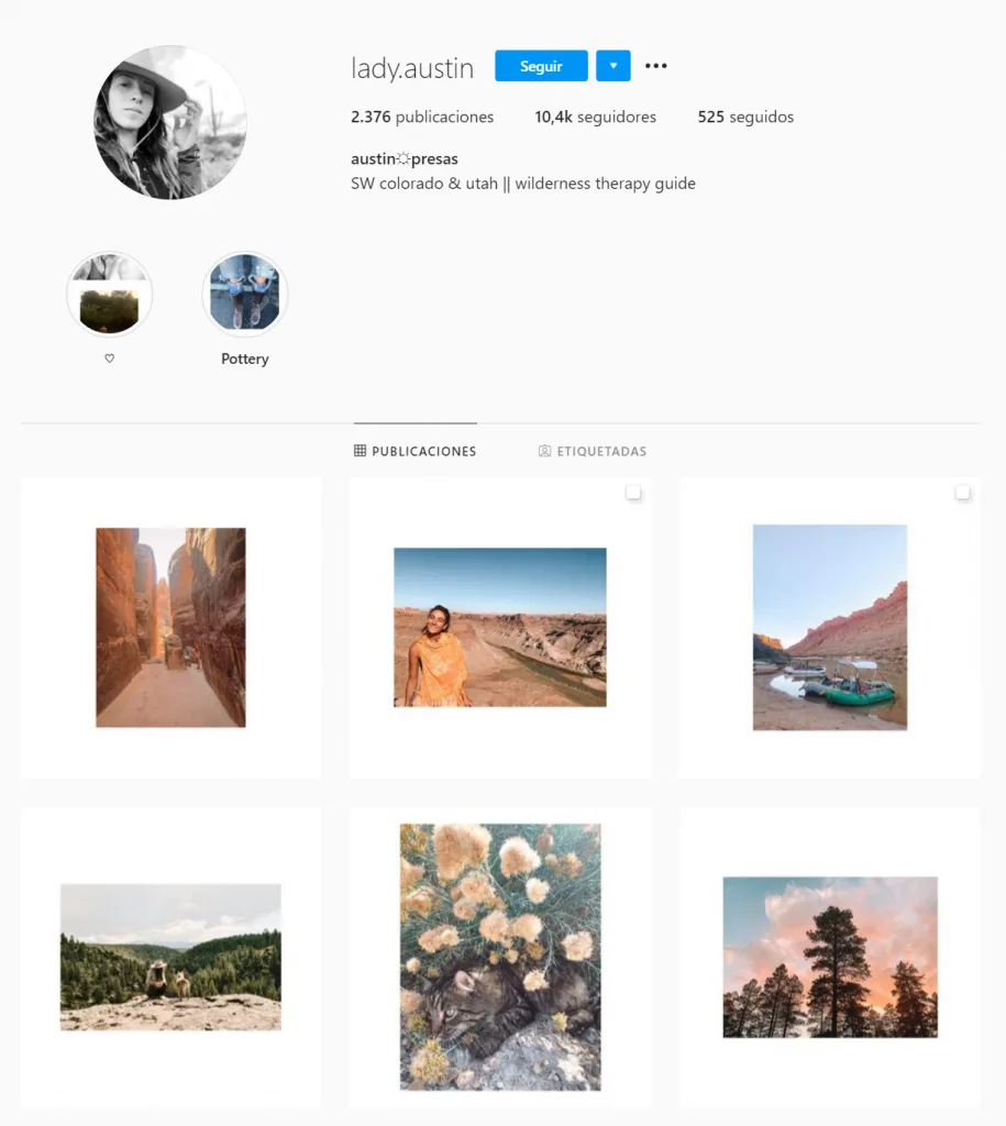
Adding a border around each post brings structure without crowding the design. A bold color or a soft pastel both work, and the frame ties your posts together while giving each one a little room to breathe. Lady.Austin keeps her feed neat with white borders, mixing horizontal and vertical shots so the wide frames make every post feel like its own small piece of art.
Dominant Color or Filter
Carrying one color or filter across every post gives your profile a signature look. Marythefairie is a fun example. She changes her hair color often, and each time she shifts the whole feed to match. Pink hair means a pink feed, green hair turns everything green. It keeps her profile feeling fresh and reinforces her personal brand. She pairs it with a checkerboard layout that alternates curated photos with reels where she talks to her audience, so the feed balances polish with personality.

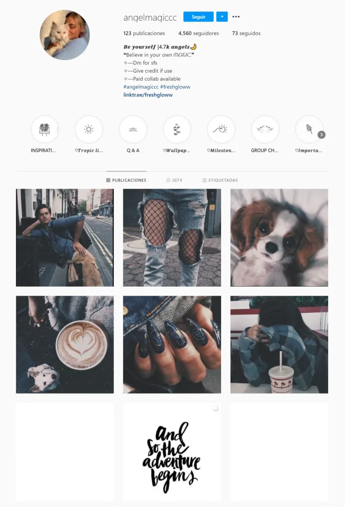
AngelMagiccc takes a steadier route, sticking to the same filter and a dominant color like red skies and dark silhouettes that set the mood across every image.
Minimalist Aesthetic
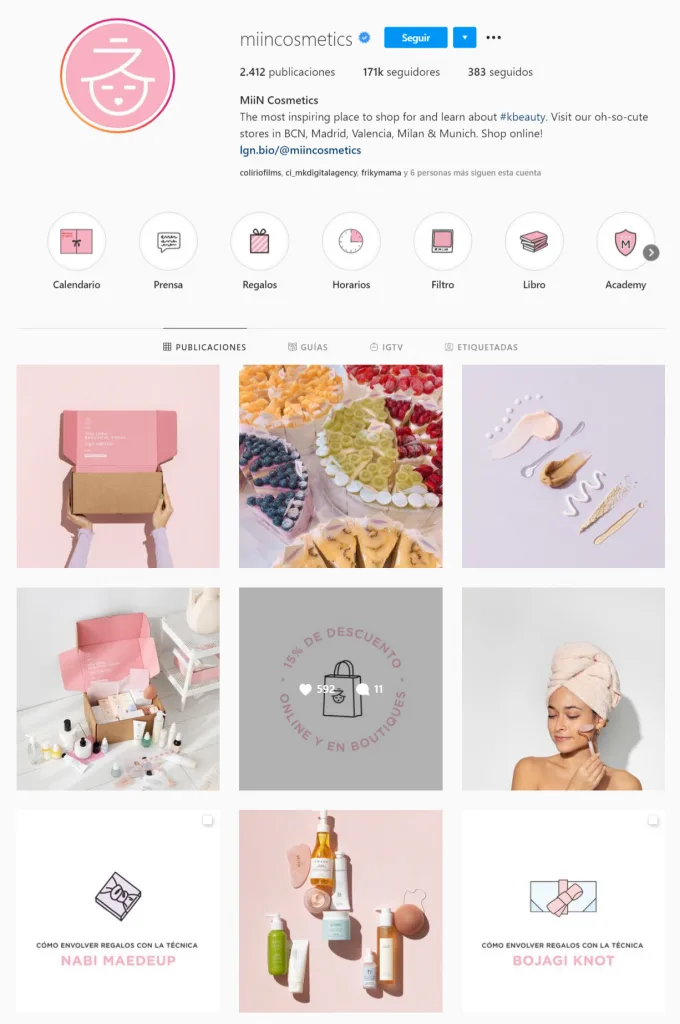
A minimalist feed strips things back to clean lines and high-quality visuals, so your content stands on its own. It suits products, designs, or lifestyle shots where the subject should be the star. MiinCosmetics has a beautiful example, mixing in some checkerboard structure and small pops of color while keeping the overall look clean so the products come through.
Vibrant vs. Monochromatic Feeds
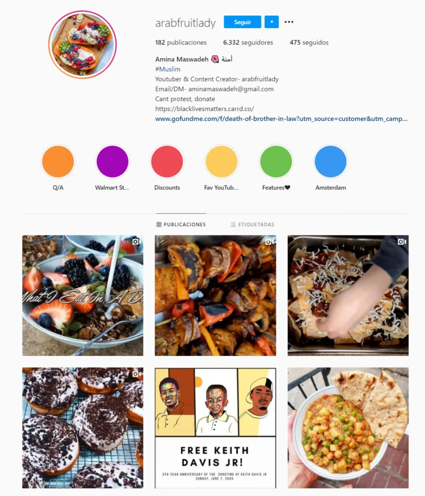
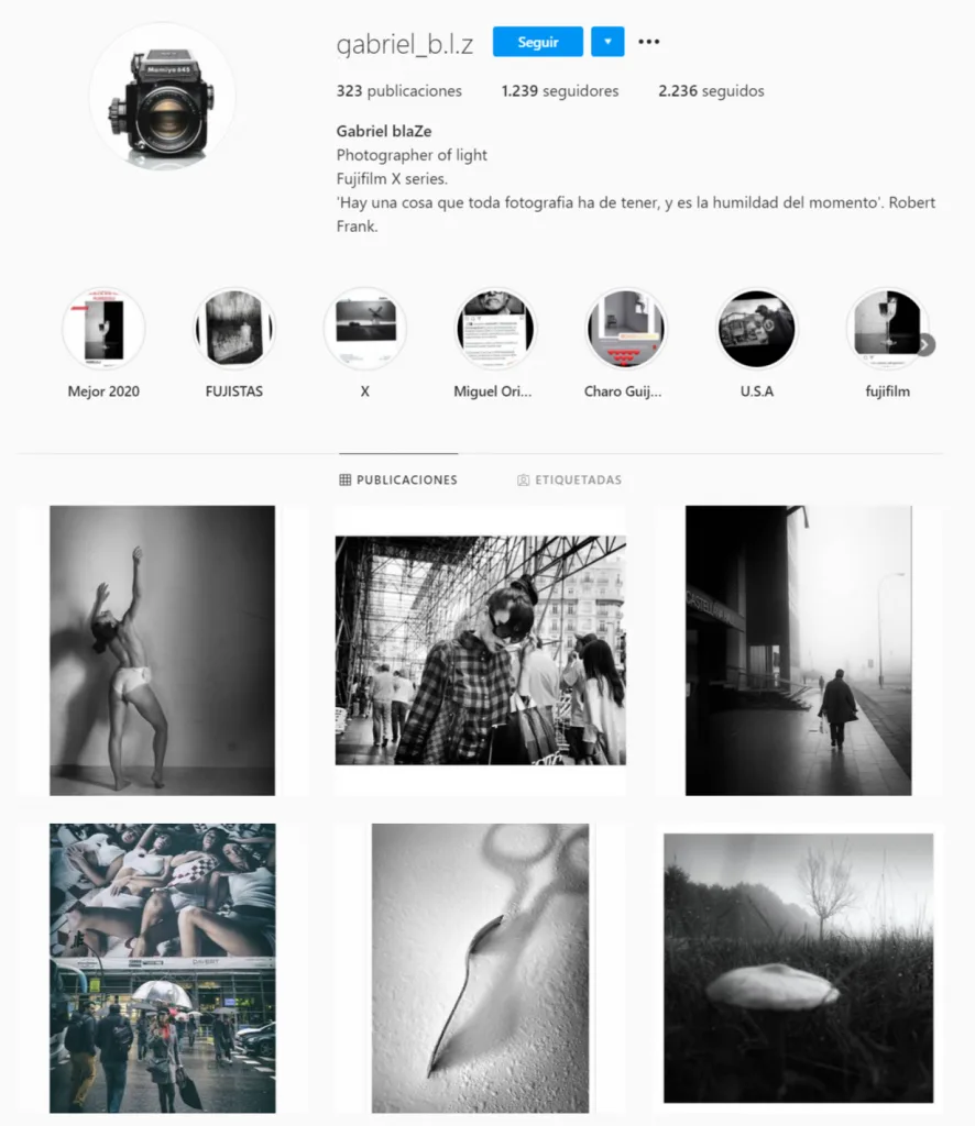
When it comes to color, most feeds lean one of two ways. A vibrant feed is full of bold, eye-catching colors that suit a playful or creative brand. A monochromatic feed sticks to shades of one color or a close palette for a sleeker, more polished result. Amina from Arabfruitdaily uses dark backgrounds so her colorful dishes pop into a vibrant feed, while photographer
Gabriel Blaze, a photographer, opts for black-and-white images to create a classic, monochromatic look. This makes his feed feel timeless and visually cohesive.
Picking the Layout That Fits
A few things to keep in mind once you’ve seen the options:
- Don’t try everything at once. Too many layouts in one feed confuse people. One or two styles make for a more intentional look.
- Match it to your brand. A bold, energetic brand can run vibrant or checkerboard layouts. A brand built on simplicity might suit minimalism or a single-color palette.
- Plan ahead. Whatever you pick, map out your posts before publishing. Metricool’s feed planner lets you schedule posts and see how they’ll sit side by side, so the grid flows the way you want.
How to Design an Instagram Carousel
A carousel is a single post that holds several slides people swipe through, marked by the small dots under the image. It gives you more room to tell a visual story across slides instead of squeezing everything into one frame.
Instagram allows up to 20 slides, with a minimum of two, though most carousels work best somewhere around five to ten so people don’t drop off before the end.
The format also earns its place in the numbers. Metricool’s 2026 Instagram Study, which looked at more than 24 million posts, found that carousels beat single-image posts on every metric, with roughly 2.4 times the reach and views and around four times the interactions. They pull in more views than any other format on Instagram right now, ahead of both Reels and single-image posts.
The standout figure is saves: carousels get nine times more saves than single-image posts. They also keep getting re-served to people who didn’t swipe through the first time, which stacks up views over the following days.
Even so, carousels are published 37% less often than single-image posts, so there’s room to stand out by using them more.
Here’s how to build one that holds together and keeps people swiping.
- Start With a Strong Cover Slide: The first slide is the only one people see in the feed, so give it a clear hook and keep it readable at a glance. It carries extra weight because 76% of a carousel’s views happen in the first three days.
- Keep a Consistent Template: Use the same colors, fonts, and layout across every slide so the post reads as one piece. Tools like Canva let you build one slide and duplicate it for the rest.
- Design for the Right Dimensions: The 4:5 portrait size at 1080 x 1350 pixels takes up the most vertical space. The first slide sets the shape for the whole post, so Instagram crops the others to match it. Pick your aspect ratio first and keep every slide the same.
- Guide People Through the Slides: Treat it like a short story with a beginning, middle, and end, with one clear point per slide. Small swipe cues like a corner arrow keep people moving, and slides that hold attention get the post re-served to more people.
- Close With a Clear Call to Action: End by telling people what to do. Asking for comments lifts them 202% and asking for saves lifts them 92%, while asking for likes drops them about 5%, so point people toward comments or saves.
- Plan and Build in Metricool: Each carousel shows up in your grid as a single cover, so check how it fits the posts around it in Metricool’s feed planner. The Metricool Carousel Agent in Claude Code can also design the slides, write the caption, and schedule the post from one conversation.
Designing Your Instagram Profile
A good-looking feed pulls people in, and the profile around it gives them a reason to stay. Here’s how to set up the parts that frame everything else.
Start With the Basics
- Username and name. Keep it simple, recognizable, and easy to search.
- Profile photo. Use a clear image that represents your brand, like a logo, a headshot, or a product shot.
- Bio. Treat it as your Instagram elevator pitch. Say who you are, what you offer, and what people should do next, with a bit of personality and a call to action.
- Link in bio. Send followers to your website, shop, or latest campaign. Metricool’s link in bio feature lets you build a small page that holds several links at once.
Set Your Visual Style
Your style should reflect your brand and stay steady across posts:
- Color palette. Pick two to four main colors and stick with them across photos, graphics, and Stories.
- Fonts. If you add text to images, choose one or two readable fonts that match your brand’s personality.
- Photo style. Decide whether you want clean product shots, candid lifestyle photos, or bold graphics, then keep it consistent.
Use Highlights and Covers
Highlights keep your best Stories front and center, sorted into tabs like reviews, products, or how-to guides so visitors find what they need fast. The covers count just as much as what’s inside. Pick a consistent set, simple icons or a matching template in your brand colors, so the highlights row reads as one piece rather than a jumble. Cohesive covers are one of the quickest ways to make a profile feel intentional the moment someone opens it.
Keep Editing Consistent
Editing is a big part of design. Using the same filters, brightness levels, or presets gives your posts a uniform feel. Apps like Lightroom, VSCO, or Instagram’s built-in editor all help you hold that consistent look across every image.
Tools That Make Instagram Design Easier
Instagram’s own editor handles cropping, filters, brightness, and quick touch-ups inside the app, which often covers what you need for fast edits. When you want more control, a few other tools help.
Canva works for beginners and experienced designers alike, with templates, graphics, and fonts for posts and Stories. You can save your brand colors and fonts to reuse across everything you make, so a clean result doesn’t take design training.
Adobe tools like Photoshop, Illustrator, and Lightroom give you professional-grade editing and design control. The learning curve is steeper, and in return you can get as detailed as you want, from retouching photos to building graphics from scratch.
Lightroom and VSCO let you apply the same presets across your photos so the feed keeps a uniform tone. Saving a preset once and reusing it on every image is one of the simplest ways to make a feed look cohesive.
Metricool brings your planning and design into one workflow. The feed planner lets you drag and drop posts to preview your grid before publishing, so you can see how the design holds together before anything goes live. It also handles scheduling and analytics, so you can plan the look and track how it performs in the same place. For timing, the 2026 Instagram Study points to 7 to 9 p.m. as the strongest posting window across accounts, though your own audience may peak elsewhere, which your Instagram analytics will show.
On premium plans, Metricool connects to Canva and Google Drive too, so the designs you make in Canva or keep in Drive show up right inside the planner. You can pull a finished carousel or post straight into your Instagram calendar without downloading and re-uploading it. Canva handles the formats you’d use for a post, including JPG, PNG, PDF, GIF, MP4, and PPTX, and a multi-page design can come in as an image with the pages you pick or as a single video that plays the pages in order.
For carousels, the Metricool Carousel Agent runs inside Claude Code and handles the whole post from one conversation. You give it an idea and some direction, and it designs the slides, writes the caption, and schedules the post in Metricool, with your approval at each step. It’s a quick way to produce a full carousel without jumping between a design app, a writing doc, and a scheduler.
Designing With Your Goals in Mind
Your design carries your brand and supports whatever you’re after on Instagram. A consistent palette, font set, and visual style make you recognizable at a glance and build trust over time.
Match the design to the goal. To promote a product, show it off with clear, simple visuals. To build closer customer relationships, lean on behind-the-scenes content and posts that feel real. Instagram’s features back this up:
- Stories for real-time updates and interactive touches like polls, quizzes, and links. Keep them in your feed’s style so the look holds together.
- Shopping to tag products so people buy straight from your feed.
- Reels to entertain while showing what you sell.
- Paid ads that match your brand’s look, so they sit alongside your organic posts instead of interrupting.
Resharing user-generated content is one of the simplest ways to earn trust, since real customers read as more genuine than branded posts. Encourage a branded hashtag or share templates followers can use.
Design pulls people in, and useful content brings them back. Custom stickers, GIFs, and text overlays add personality, and a mix of product features, behind-the-scenes moments, and testimonials keeps the feed varied. A few strong posts beat a steady stream of filler.
Once it’s live, check the numbers. Instagram’s insights show likes, comments, shares, reach, and impressions, so you can make more of what works and rethink what doesn’t.
Instagram Design as Part of Your Social Media Strategy
Instagram design comes down to a handful of choices made on purpose and kept consistent: a color palette you stick with, a layout style that fits your brand, carousels built to be swiped, and a profile that tells people who you are in a glance. You don’t have to get it perfect on day one.
A simple next step: open Metricool’s feed planner, drag in your next few posts, and see how the layout you picked looks before it goes live.
