The Psychology of Color in Branding & Marketing
 Gretchen Oestreicher
23 December 2025
Gretchen Oestreicher
23 December 2025 
Picking the right colors for social media can feel like a puzzle, but it’s one of the most powerful tools in marketing.
Colors influence how people notice your content, how they feel about your brand, and how they engage with your posts. This guide dives into color theory and color psychology, helping you use your palette to convey the brand personality you want, create social media visuals that connect, and support your marketing goals.
1. Understanding Color Theory and Psychology
Before choosing colors, it helps to understand how color works. Color theory and psychology explain why certain combinations feel balanced, why some tones spark emotion, and how to guide attention in your visuals.
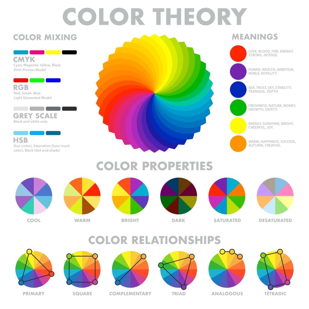
Color Theory Basics
Color theory is a simple framework for making your visuals look balanced and easy to follow. It helps you choose hues that support your message, highlight important elements, and keep your feed cohesive.
Primary colors are red, yellow, and blue, which form the base for every other color you see on your feed.
Secondary colors come from pairing these primaries, like orange, green, and purple.
Tertiary colors mix a primary with a secondary to create more subtle tones.
Once you know the basics, you can use color systems to create palettes that feel intentional and polished.
Color theory also covers visual balance, including contrast, hierarchy, and readability, and color harmony, achieved with combinations like:
- Monochromatic: Variations of a single color. This keeps everything clean and minimal, and it works well for brands with a calm or refined aesthetic.
- Complementary: Two opposite colors, for example red and green. This contrast draws the eye, which makes it helpful when you want a CTA or headline to stand out.
- Analogous: Colors that sit next to each other, such as yellow, yellow-orange, and orange. This creates a natural flow, especially in lifestyle or wellness content.
- Triadic: Three evenly spaced colors. This palette feels energetic and balanced, which is useful when your content needs personality without visual clutter.
- Split Complementary or Tetradic: More advanced combinations that pair one main color with two or three supporting accents. These create contrast and harmony at the same time, often seen in polished brand systems.
- Pastel Palettes: Soft and friendly, great for coaching, education, and accessible storytelling.
- Neon: Bright and high-energy, often used in gaming, youth-focused campaigns, and events. Best used carefully so the text stays readable.
These choices guide the visual rhythm of your content, helping your audience understand what matters at a glance.
What Is Color Psychology?
Color psychology studies how colors and tones influence what people think, feel, and do. Each hue can spark emotions like calm, excitement, trust, or urgency. These subtle cues often guide simple actions, from tapping a button to following a new account.
For creators, small brands, and freelancers, color choices shape how your content is understood in seconds. The right palette helps your audience instantly get the vibe and purpose of your posts.
Why Color Matters for Marketing
Users scroll fast, and first impressions happen in seconds. Research shows that people make up their minds about a product or person within just 90 seconds, and remarkably, 62% to 90% of that initial assessment is based on colors alone.
A large part of first impressions comes from color, making your palette one of the most powerful tools in your content strategy.
Here is what thoughtful color use can help you do:
- Stand Out in Busy Feeds: Consistent color choices help people recognize your posts quickly, even without reading the caption.
- Strengthen Brand Recognition: When your colors appear the same way across platforms, people recognize you. McDonald’s red and yellow, Coca-Cola’s red and black, and Hershey’s brown and silver are all clear reminders of how powerful repetition can be.
- Guide Viewer Actions: Warm tones can highlight a CTA, a time sensitive update, or a product drop. Cooler tones can support educational, financial, or health content where clarity and trust matter.
- Support Accessibility: High contrast colors help all viewers understand your visuals. This also improves how your content performs across devices.
2. Color Meanings in Marketing
Color plays a bigger role in marketing than some may think. It influences how people feel, where they look, and what they remember. Here’s how common colors shape mood and how to use each one with confidence for your brand.
Red: Passion, Energy, Urgency
Red grabs attention fast. It signals movement, bold decisions, and quick actions. If you need someone to pause their scroll, red can help. In fact, red buttons have been shown to boost conversions by around 34%, making it a smart choice for calls to action.
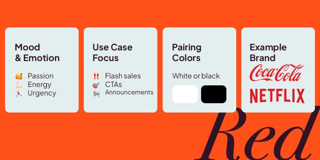
What It Brings: Excitement, urgency, and a strong nudge to take action.
What To Watch For: Too much red can feel tense or overwhelming. When used with other strong colors, it may increase stress instead of motivation. The meaning behind red can change dramatically across cultures.
Real Examples: Coca-Cola, Netflix, YouTube, and McDonald’s
Try It For: Flash sales, time-sensitive offers, announcement graphics, or strong calls to action.
Tips For Your Posts
- Pair red with white or black to keep the design grounded.
- Use red for buttons, stickers, and outlines instead of full backgrounds.
- Test softer tones like scarlet or coral to see if your audience responds better.
Orange: Warmth, Creativity, Friendliness
Orange adds personality without feeling overwhelming. It brings a friendly, upbeat tone for creators and lifestyle brands. Interestingly, 33% of women and 22% of men dislike orange, yet this makes it highly effective for conversion-focused elements since it stands out against more common color schemes.
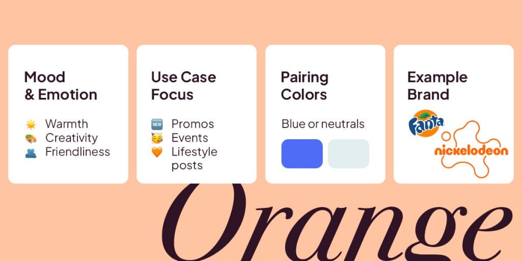
What It Brings: Warmth, creativity, and a sense of play.
What To Watch For: When used too heavily, orange can feel childish or cheap, and very bright oranges may reduce readability.
Real Examples: HubSpot, Fanta, and Nickelodeon
Try It For: Promo banners, event announcements, and lighthearted content.
Tips For Your Posts
- Pair orange with blues or neutral tones to stay balanced.
- Use orange gradients in Stories or carousel covers for a soft, modern feel.
- Experiment with different shades. Soft tangerine, burnt orange, peach, or pumpkin can add warmth without being overpowering.
- Avoid heavy blocks of orange behind long text to maintain readability.
Yellow: Optimism, Joy, Visibility
Yellow makes content feel bright and open. It draws the eye quickly, which can help important details stand out.
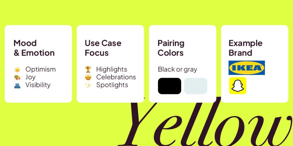
What It Brings: Joy, clarity, and strong visibility.
What To Watch For: Large areas of bright yellow can feel overwhelming or cause eye fatigue on mobile screens.
Real Examples: IKEA, Snapchat, and Bumble
Try It For: Celebrations, product highlights, and spotlight callouts.
Tips For Your Posts
- Use yellow as an accent or highlight color.
- Pair yellow with black or gray to keep text crisp and readable.
- Try soft yellow for a friendly tone and bold yellow when you want stronger energy.
Green: Growth, Balance, Sustainability
Green brings a sense of progress and wellbeing. It feels grounded, calm, and reliable, which is why it works so well for content about improvement or healthy habits.
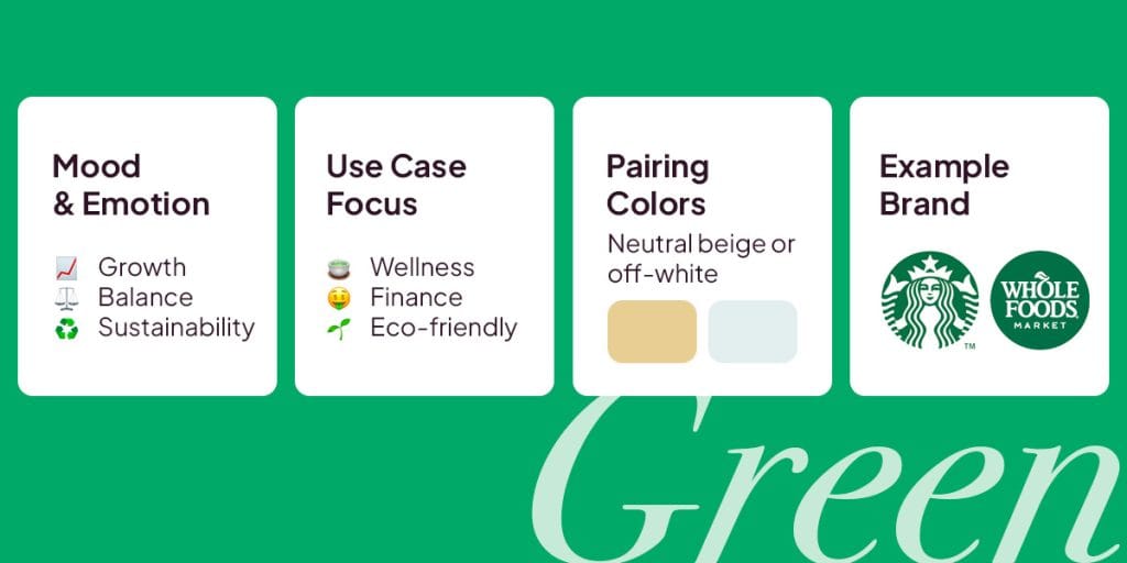
What It Brings: Calm, health, sustainability, and steady progress. It signals trust and a natural touch.
What To Watch For: Dull greens can feel flat or uninspiring. On the other hand, neon greens may look artificial or even “toxic” on bright screens.
Real Examples: Starbucks, Shopify, and Whole Foods
Try It For: Wellness updates, finance advice, sustainability content, or anytime you want to highlight progress.
Tips For Your Posts
- Use deep green for serious or luxury-focused visuals.
- Choose bright green when you want freshness or vitality.
- Pair green with neutrals for dashboards, wins, and milestone graphics.
Blue: Trust, Calm, Professionalism
Blue creates a calm, steady presence. It works especially well for content that needs to feel informative, reliable, or educational.
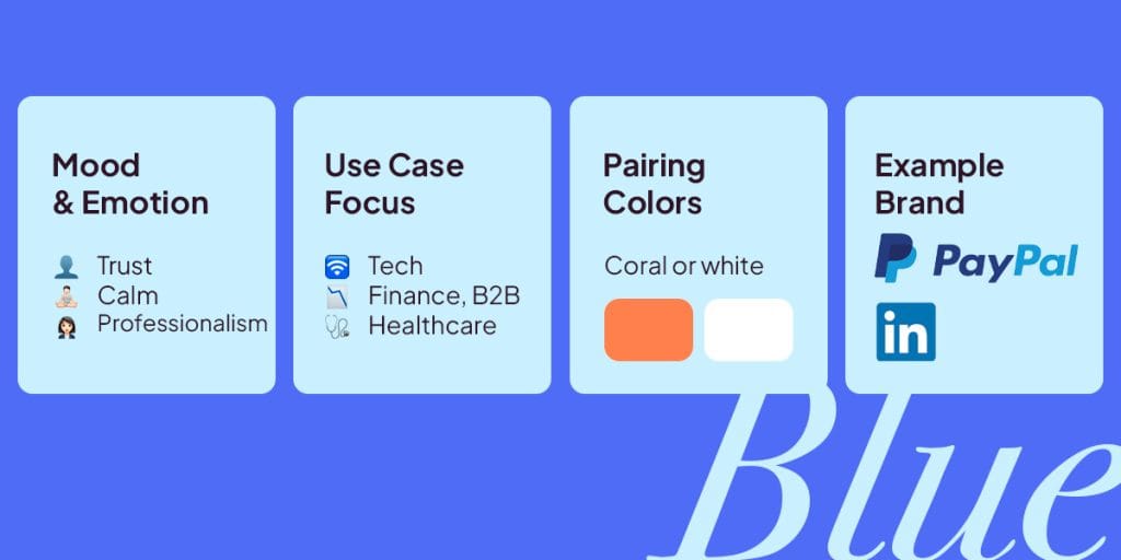
What It Brings: Stability, clarity, and a dependable tone.
What To Watch For: Heavy use of dark blue may feel old-fashioned, while too much blue overall can create distance rather than connection.
Real Examples: LinkedIn, PayPal, and Facebook
Try It For: B2B posts, tech announcements, finance topics, and healthcare updates.
Tips For Your Posts
- Dark blues feel formal, while lighter shades feel open and friendly.
- Add a warm accent like coral to help important buttons or CTAs stand out.
- Blue works well for charts, data visuals, and clean UI previews.
Purple: Luxury, Creativity, Imagination
Purple gives your visuals a touch of sophistication while still feeling curious and expressive. Historically, it was the color of royalty, giving it a long-standing association with luxury and prestige. Use it when you want your content to feel elevated without being too serious.
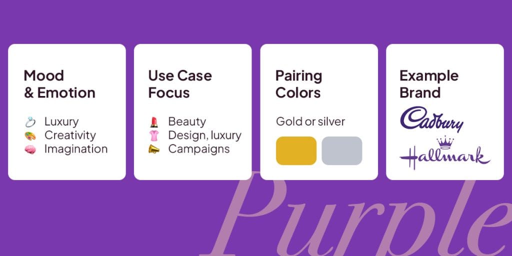
What It Brings: Originality, elegance, royalty, and thoughtful design.
What To Watch For: Very dark purples may limit visibility, while certain shades can feel overly mysterious or pretentious if the tone is not right.
Real Examples: Cadbury, Twitch, and Hallmark
Try It For: Beauty and design content, luxury campaigns, and creative storytelling.
Tips For Your Posts
- Combine purple with gold or silver for premium visuals.
- Lavender brings softness, while violet delivers depth and boldness.
- Works beautifully in mood boards or Reels with a calm, elegant feel.
Pink: Playful, Compassionate, Modern Femininity
Pink adds expression and charm. It brings personality into your visuals while still feeling polished and friendly.
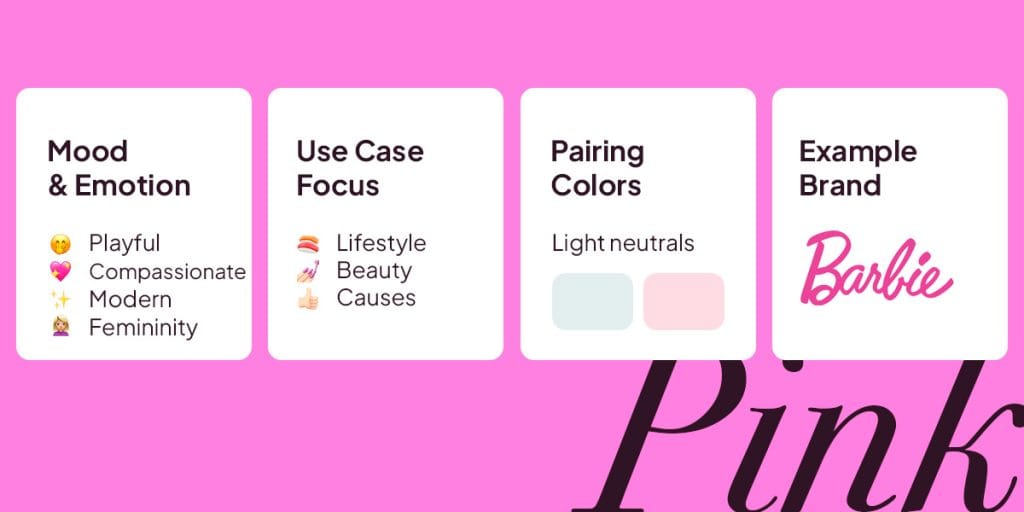
What It Brings: Warmth, fun, and emotional connection.
What To Watch For: When unbalanced, pink may feel overly sentimental or juvenile. Strong gender stereotypes can also appear if it is not paired with grounding neutrals.
Real Examples: Barbie, Klarna, and T-Mobile
Try It For: Lifestyle themes, social causes, beauty content, or fashion posts.
Tips For Your Posts
- Pair pink with neutral tones for cleaner readability.
- Vibrant pink brings excitement, while muted pink creates a calm and modern feel.
- Great for CTAs, overlays, and visual stories that rely on emotion.
Black: Sophistication, Authority, Simplicity
Black creates a strong sense of confidence and clarity. It pulls attention to the most important parts of your visual and gives your content a focused, intentional feel. Heritage brands, high end fashion houses, and legacy designers often use black to reinforce luxury, authority, and timeless elegance.
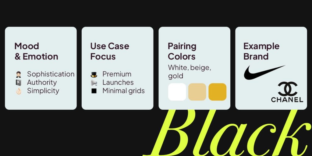
What It Brings: Confidence, clarity, and intensity. It sharpens your message and keeps the viewer’s eye right where you want it.
What To Watch For: Heavy use can feel intimidating or overly stark. Strong contrast may also create eye strain on mobile.
Real Examples: Nike, Chanel, and Apple
Try It For: Premium product launches, minimalist grids, and typography-first designs.
Tips For Your Posts
- Black backgrounds make bright accents and photography stand out.
- Combine black with white, beige, or gold for a timeless look.
- Use black intentionally so your feed does not feel heavy.
White: Simplicity, Clarity, Space
White brings structure, calm, and room to breathe. It is one of the easiest colors for creating a clean and modern look.
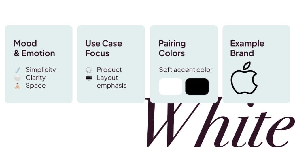
What It Brings: Simplicity, calm, and visual order. It helps the viewer focus on what matters.
What To Watch For: Without accents, white can feel sterile or bland. It needs supporting colors to feel warm and inviting.
Real Examples: Apple, Google, and Adidas
Try It For: Backgrounds, product showcases, and clean carousel layouts.
Tips For Your Posts
- Add white space around text and objects to guide focus.
- Pair with one or two accent colors for a modern, balanced look.
- Works very well for infographics and educational content.
Brown: Warmth, Reliability, Craftsmanship
Brown brings a grounded, earthy character to your visuals. It communicates honesty, comfort, and a handcrafted touch.
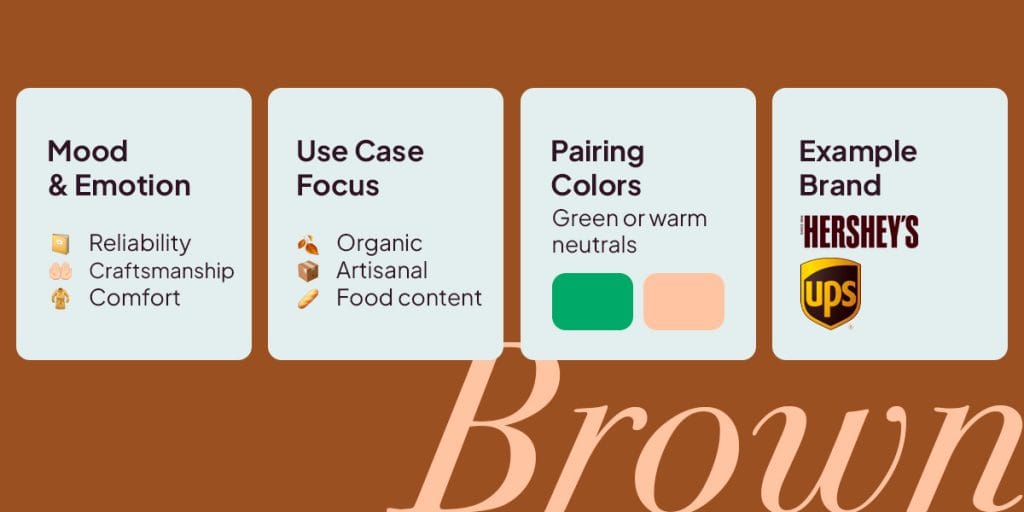
What It Brings: Warmth, reliability, and a natural tone.
What To Watch For: Too much brown can feel dated or overly serious. Dark shades may also mute key elements.
Real Examples: Hershey’s and UPS
Try It For: Organic products, artisanal brands, and food or beverage posts.
Tips For Your Posts
- Pair brown with green for a natural, welcoming feel.
- Add textures like wood or paper to highlight authenticity.
- Great for cozy, handmade, or nostalgic visuals.
Grey: Neutrality, Balance, Modernity
Grey is steady and neutral, which makes it a strong base for content that needs structure without distraction.
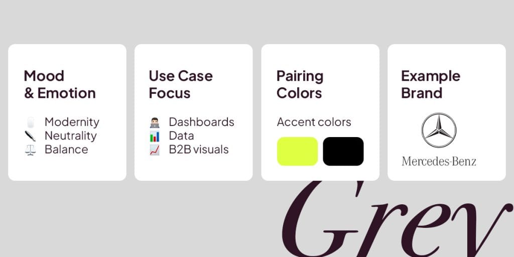
What It Brings: Calm objectivity and a modern, polished tone.
What To Watch For: Too much grey may feel lifeless or detached. Low-contrast combinations can also reduce readability.
Real Examples: Apple, Mercedes-Benz, and Sony.
Try It For: Dashboards, data visuals, B2B posts, tech content, and UI previews.
Tips For Your Posts
- Use grey as a base so your accent colors handle the mood.
- Light grey keeps frames, cards, and carousel slides clean.
- Choose mid to dark grey for text to maintain accessibility.
Silver and Metallics: Innovation, Futurism, Premium Tech
Metallic tones bring a high-tech, forward-looking feel. They are great when you want your visuals to look advanced or future-focused.
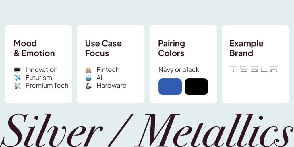
What It Brings: Innovation, precision, and premium quality.
What To Watch For: Too much shine can distract or feel artificial. Poor digital rendering may create unwanted noise.
Real Examples: Mazda, PlayStation, and SpaceX
Try It For: Product reveals, hardware launches, fintech posts, and AI-focused visuals.
Tips For Your Posts
- Pair silver with navy, charcoal, or black for a high-tech aesthetic.
- Metallic gradients work nicely in device mockups and UI previews.
- Keep other colors minimal so the metallic effect stays clean.
Beige and Taupe: Soft Neutral, Comfort, Subtlety
Beige, taupe, and soft neutrals convey warmth, comfort, and understated sophistication. They work especially well for the rise of “quiet luxury” and high-end wellness brands, giving visuals a polished, serene feel without shouting for attention.
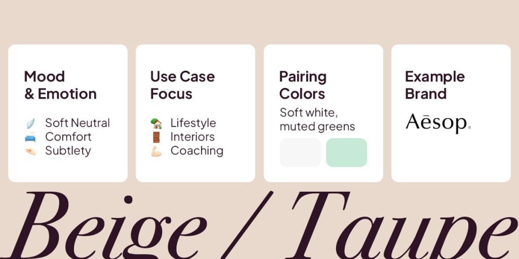
What It Brings: Comfort, subtlety, and a refined modern mood.
What To Watch For: Overuse may make content feel washed-out or low contrast. Lighter shades may also fade on mobile.
Real Examples: Everlane, Goop, and Aesop
Try It For: Luxury lifestyle content, coaching, wellness posts, and interior visuals that aim for a high-end, calming aesthetic..
Tips For Your Posts:
- Pair with soft whites and muted greens for a modern, cozy palette.
- Use beige for backgrounds to keep your grid consistent.
- Great for Reels covers or carousel covers that need a soft, polished look.
3. Choosing Brand Colors to Reflect Your Personality
Your color palette is more than a collection of shades. It’s a visual system that communicates your brand personality, guides audience emotions, and makes your content instantly recognizable.
Here’s how to build one step by step.
1. Define Your Brand Strategy First
Before picking colors, clarify your foundation:
- Brand Personality: Are you bold and disruptive, calm and supportive, playful, or luxurious?
- Core Emotions to Evoke: Trust, excitement, safety, aspiration, playfulness, or creativity.
- Audience and Category: Consider B2B vs B2C, price point, and industry norms like finance, wellness, or tech.
Your colors should feel natural for your brand. Bright, playful tones suit youth-focused or budget-friendly content. Muted or darker palettes work for premium, editorial, or B2B brands. Out-of-place colors can reduce trust even if the design looks polished.
2. Decide Your Color Roles
Instead of random favorites, assign each color a role in your branding:
- Primary Color: Anchors brand recognition and expresses your main emotion (blue for trust, green for growth, red/orange for energy).
- Neutrals: One or two colors for backgrounds, typography, and supporting elements (white, off-white, grey, beige).
- Accent Color: Highlights key points, buttons, or CTAs. Choose a hue that complements or contrasts the primary color.
- Optional Secondary Color: Adds variety for campaigns, product lines, or seasonal content.
Color psychology is what guides these roles. Warm accents draw attention, cooler accents convey stability, and muted neutrals create calm and clarity.
3. Check Culture and Accessibility
Colors set the mood, but clarity and context keep your audience engaged. Make sure your palette works for everyone and in every region by considering these factors:
- Accessibility: Use strong contrast between text and backgrounds. Pair colors with icons or labels so posts remain readable for people with color blindness or who rely on screen readers. Preview designs on mobile and in dark mode to avoid harsh or invisible elements.
- Cultural Context: Color meanings vary across regions and traditions. What feels cheerful in one market may feel formal, negative, or even sensitive elsewhere. Some examples:
- Red: Luck and celebration in Asia; urgency and passion in the West; life or mourning in parts of Africa.
- White: Purity and freshness in the West; mourning in parts of Asia and Eastern Europe.
- Black: Mourning in many cultures; sophistication and authority in others.
- Yellow: Happiness in the West; jealousy or mourning elsewhere; royalty in parts of Asia.
- Blue: Trust and calm in the West; spirituality or mourning in other regions.
- Green & Purple: Green is nature and growth in the West but may be taboo elsewhere. Purple signals royalty but can also mean mourning or bad luck in some countries.
- Test and Adjust: Use tools like Google Market Finder or small audience tests to see how your colors are interpreted. Minor tweaks often improve engagement while keeping your visuals consistent.
4. Build Variations With Saturation and Value
Once you’ve chosen your main colors, you can create variations to add depth and flexibility to your visuals. Play with tints (lighter), shades (darker), and desaturated versions of your core colors to match the mood of each post.
- Bright, Saturated Tones: Grab attention for sales, launches, and Stories covers.
- Muted or Darker Tones: Work well for educational carousels, dashboards, or long-form content.
Adjusting saturation lets you control emotional impact without changing the base color. Brighter tones bring energy and urgency, while muted tones keep your content grounded and easy to read.
5. Prototype and Test in Real Content
Colors look different in practice, so don’t rely only on a brand deck. Seeing your palette in action helps you make confident choices that actually work for your audience.
- Test your palette on 3–5 post types. Try Reels covers, carousels, quotes, data graphics, and promo posts.
- A/B test accent colors for buttons and key frames. Measure clicks, saves, watch time, and engagement.
- Combine performance data with qualitative feedback from comments, DMs, focus groups, and stakeholders.
A strong palette feels consistent with your brand, is instantly recognizable, and performs well across formats. Testing helps you make sure your colors work in practice and aren’t biased by assumptions.
6. Apply Your Palette Consistently
Consistent colors help people recognize your brand instantly. Frequent changes or trend-hopping can make your visuals feel unfamiliar. Follow these steps to put your colors into action:
- Pick a Core Palette: Choose 2 to 3 colors that reflect your brand personality. For example, soft greens and neutrals work well for wellness or coaching content, while bright blues feel fresh and tech-focused.
- Use Accent Colors Purposefully: Add one strong accent for buttons, highlights, or promotional posts. This helps guide attention without overwhelming your core palette.
- Maintain Consistency Across Platforms: Make sure your colors work across your website, newsletters, Instagram Stories, Reels covers, TikTok thumbnails, link-in-bio graphics and more. A cohesive look builds recognition and trust.
- Check Contrast Before Publishing: Test text and background combinations on multiple devices to ensure readability. Clear contrast helps all viewers understand your message.
- Review and Refine: Track engagement and performance with tools like Metricool. Adjust colors gradually based on results, audience feedback, and real-world use.
Palette Examples by Goal:
| Goal | Ideal Palette | Why It Works |
| Urgent offers | Complementary or split complementary warm tones | High contrast drives attention |
| Trust and authority | Monochromatic or analogous blues/greens | Professional, calming visuals |
| Lifestyle/wellness | Soft analogous or pastel | Relatable, low-pressure tone |
| Youth/creative culture | Triadic or neon accents | Energetic, engaging content |
| Minimalist/luxury | Monochromatic neutrals or black-white with one accent | Clean, premium look |
Design Tip: Use the 60:30:10 ratio — 60% main color, 30% secondary, 10% accent — for visual balance.
4. Applying Colors in Social Media Marketing
Now that you have your brand palette, it’s time to bring it to life on social media.
Colors do more than make your posts look nice. They guide attention, influence emotions, and help people remember your brand across platforms.
How you use them matters for recognition, readability, and audience connection. In this section, we’ll cover how to work with your core palette, try accent colors, keep designs clear, and stay true to your brand personality.
Your Palette Is a Guideline, Not a Cage
Your core brand colors show who you are, but they don’t lock you in. Think of your palette as a foundation for your social media and marketing visuals. It keeps content consistent and recognizable, while small, thoughtful variations keep your feed feeling fresh.
When It’s Fine to Step Outside Your Palette
- Seasonal or Campaign Updates: Temporary accents for holidays, product launches, or special campaigns keep your core palette intact.
- Highlight Important Actions: Off-palette colors can draw attention to CTAs, promotions, or time-sensitive posts.
- Experiment and Test: Trying new tones shows what resonates and can boost engagement.
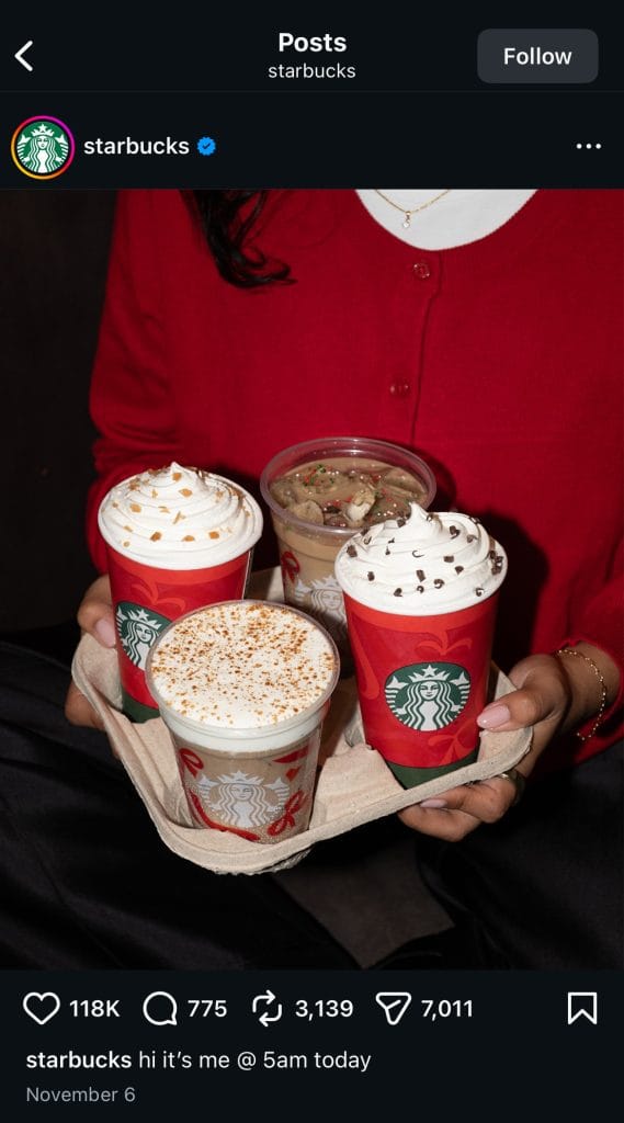
For example, Starbucks’ core palette of green, neutrals, and brown reflects warmth and approachability. During the holidays, they add a muted red on seasonal cups and packaging. The accent signals the season without overpowering the brand’s familiar colors.
How to Keep It Balanced
- Make sure new colors don’t clash with your main palette or reduce readability.
- Use off-palette colors sparingly so your brand stays recognizable.
- Treat them as accents, not replacements, unless doing a full brand refresh.
Emotional Intensity and Saturation
Brightness and depth affect feelings as much as the hue itself. High-saturation colors bring energy and urgency, making them perfect for limited-time promotions or eye-catching announcements. Muted tones feel calm and modern, which works well for data-heavy visuals like infographics or educational posts, though they may need a strong accent to draw attention. Adjusting saturation is an easy way to connect emotional tone, branding, and your content’s purpose.
Context: Platforms, Formats, and Display Modes
Your colors can look very different depending on where and how people see them. A palette that works on Instagram Reels might feel off on a LinkedIn post. Industry norms like blue for finance or green for wellness can guide choices, but intentional deviations can help your brand stand out. Always preview your visuals across platforms, in different formats, and on both light and dark modes to avoid harsh contrasts or readability issues.
Behavior and Conversion Goals
Colors guide action. Warm tones like red, orange, and yellow draw attention to CTAs or time-sensitive elements. Cooler tones like blue and green feel trustworthy and thoughtful, fitting for “learn more” or financial actions. Premium brands often mix black, white, gold, or silver especially with product launches. Match your colors to the response you want from your audience.
Testing and Data Over Assumptions
Trends, culture, and technology change color perception. A/B test thumbnails, CTA colors, and backgrounds to see what drives clicks, saves, and conversions. Compare performance by palette style to build a system that’s both recognizable and high-performing.
Trends in Color Psychology in 2026
1. Digital Naturals and Earthy Minimalism
Warm neutrals, clay tones, muted greens, and soft beige are everywhere in lifestyle, wellness, and sustainability spaces. These colors create a sense of calm and authenticity. They work especially well for creators, eco-conscious campaigns, and brands built around balance and wellbeing.
2. Soft Tech Palettes
Tech and AI visuals are shifting away from sharp blues and cold metallics. The trend moves toward gentler shades like misty lilac, sage green, sand gray, satin silver, and soft off-white. This palette helps advanced tech feel more human and approachable.
3. Retro-Futurism and Gradient Revival
Gradients are back, but with refinement. Expect smooth blends like lavender to tangerine or teal to rose gold. These palettes feel nostalgic yet polished, perfect for Reels backgrounds, animated visuals, or app branding.
4. Elevated Monochrome
Black-and-white remains a classic, and brands are refreshing it with subtle shifts like graphite, stone, and off-white. These tones give the monochrome style more depth while staying clean and minimal.
5. Emotional Energy Colors
Balanced, expressive tones stand out in today’s neutral-heavy feeds. Coral red, powdery blue, sunny saffron, and digital lavender bring emotion without overwhelming the viewer. This trend leans toward calm energy instead of harsh brightness.
The Advantage of Color in Marketing
A consistent and thoughtful color system does more than look good, it makes your brand instantly recognizable. Think about Coke-red or Snapchat-yellow, people notice and remember before reading a single word. Your palette is part of your brand’s personality, so use it thoughtfully, track how it performs, and adjust as your audience grows.
Color choices quietly guide emotion, influence action, and build trust. When it comes to branding and social media, keep your designs intentional, stay consistent with your core colors, and let your visuals speak for your brand.
